The non-industry folk pushed the usual ‘who cares, how much did it cost, they’ve not even changed anything’ rhetoric, whilst industry experts made their attempt to defend what we do with some overly tangential rationale ending nowhere near where it started. Then we all settle down and think little more of it until the next time we walk past the product on a shelf.
So, to avoid the tangent, we’ll keep it brief. Like it or not, Pepsi have made a bold move which is remarkably in-keeping with their always present challenger attitude.
Orlando Wood (System1, author and all-round industry legend) wrote at length in Lemon about the overwhelming, concerning shift towards rational and reductive brand design (and left-brain dominance throughout marketing as a whole).
Love it or hate it, Pepsi’s move pushes back against the trend which has seen giants like BMW, Burger King and VW strip any personality from their brand identities, leaving flat reductive shadows of form-over-function in it’s place.
Pepsi’s new identity, albeit not ground-breaking and essentially nostalgia with bells on, deserves praise for bucking this trend. There’s depth and perspective, the colours are deeper, there’s the wave of a red, white and blue flag and a typeface with personality.
To save hours of pontification, our Creative Lead, Victoria Harrison, summed it up perfectly with a question many super brands could keep in mind before pressing the big red button.
Would it look good on a t-shirt?
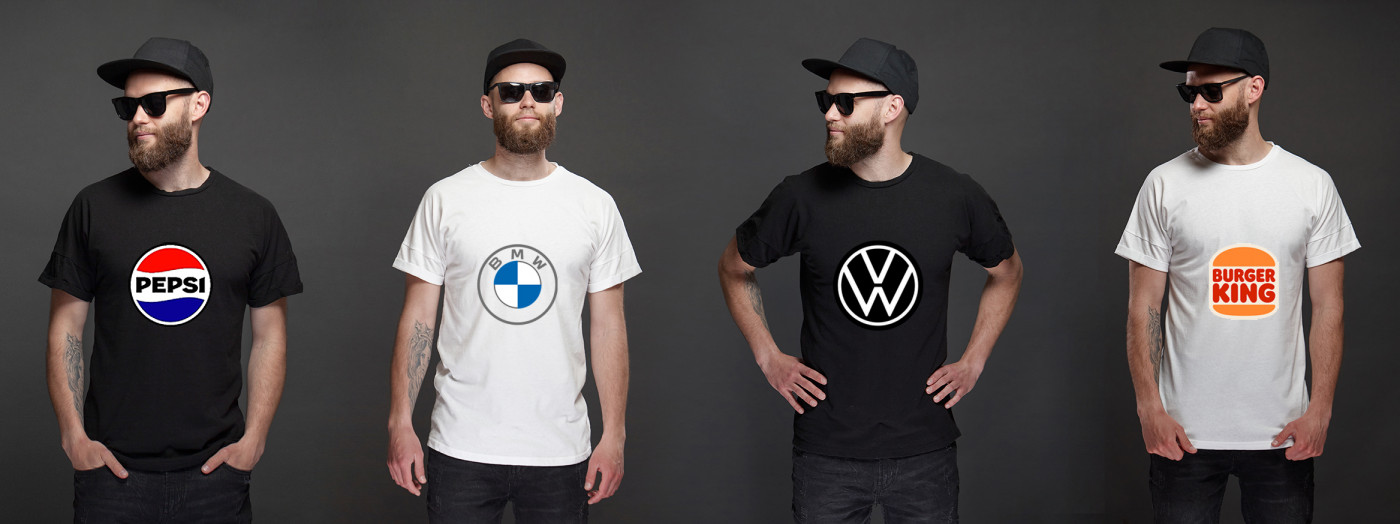
It might sound simple and superficial, but if a brand’s ultimate goal is fame and popularity - to exist within popular culture - it’s not a bad question to ask. Perhaps the drive to develop functional devices which translate seamlessly across devices and channels is to blame?
There is however a build from Paul Nichols (our Creative Director), who asked whether it needs to say Pepsi at all? Surely the red, white and blue bottle-top roundel is so synonymous with Pepsi that they can drop the name completely?
To find out how we can help to make your brand unforgettable, please get in touch at hello@principlesagency.co.uk